Post a picture of the game you played and write a succinct critique of the game’s graphic qualities.
Games at Work: Participation, Procedure and Play
BARD COLLEGE — IDEA 135
Post a picture of the game you played and write a succinct critique of the game’s graphic qualities.
Comments are closed.
I played Metroid on the Nintendo and it was pretty interesting. The graphics were alright, but the controls took a little getting used to. For one of my favorite game franchises, Metroid had a rather humble start.
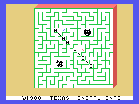
I played the Indoor Soccer game in the Texas Instruments TI-99/4A computer. The graphics were very old, and it seems like very cheap/ not well-defined animation. It is also 2D; there is no seen of depth. There is not much color range; the colors seem repetitive. I am not a fan of soccer online games, but the simplicity of this game made it more enjoyable since I am no expert in playing soccer.
I played “Shield Shifter” and enjoyed the repetition of it. Its one of those games that you can play over and over because it’s so simple. The ‘thing’ that you are shooting at, that is also shooting at you, is constantly moving and doesn’t change size or speed. The graphics are super simple and two dimensional but one of the better games on the Atari set. The strongest part about this game is its simplicity, rapid movement, and predictability because having to dodge the white bullets, red bullets, and add some other element on top of that would make it too hard. The only thing I would add is some levels that could change the colors or amount of bullets you have or something, so its not just one screen. https://i.ytimg.com/vi/3MqYRtizusw/maxresdefault.jpg
I played Castlevania and noticed some interesting ways in which the graphics affected the gameplay. First of all, the attack animation with the player character’s whip seems to have two frames, a wind up and a strike. In my recent research I learned of a tendency in modern games to use single frame attack animations with a sort of smoke trail behind the players weapon or arm to simulate the windup. Because Castlevania uses a two frame animation rather than one frame, it can feel like the attacks have a slight lag to them, adding a layer of difficulty to the game. Other than this, the contrast of the background colors was often a bit jarring and made enemies (especially ones with blinking or semi-transparent animations) very difficult to see. The animation was very simple, with both enemies and stamina-boosting candles simply turning into small sparks when destroyed, though I appreciated how the bosses had more impressive death animations, turning them into whole clouds of flame. I also really enjoyed the map graphic on the loading screen which shows the player character’s position in the castle on a paper map in the background while the character sprite walks across the screen.
Adventure!
Year: 1979
Original Console: Atari 2600
In 1974, twenty five years before myself, my hobby was born. When the now monolithic Dungeons & Dragons was released, D&d Zero, or ‘the little brown booklets’, was more than an innovation on the pre-existing form of the miniature wargame. D&d invented an entire genre, the role playing game. Before D&d there were no ‘rpg’s, at least not in a form that we would recognize in american popular culture, (Playing At The World by Jon Peterson has interesting things to say on the subject); this is true also for Adventure. Adventure is widely credited as the first video-game in the ‘adventure’ genre and among its innovations are the defining features of that genre. The multi-screen play, the seeking out items to unlock further content and of course the fighting of big-bad monsters. This review isn’t a comparative essay about these two genre-defining games, or Adventure’s place in history, or even an analysis of the genre-conventions themselves, it’s about Adventure’s Aesthetics. I bring up D&d in this context at all for two reasons. The first is that TRPG’s are my hobby and D&d is the adventure game I play most often so D&d and similar provided a lot of my frame of reference (beyond Undertale, Gungeon and the three hours I played of the original Zelda). The second is that I have observed a similar trend in the aesthetic development of both D&d and the admittedly broader adventure game genre as both have progressed historically.
As the technology has progressed and the audience for both has grown from the mid-late seventies to now, the aesthetics of both of these kinds of games have grown not only more complex but more central to their play experience. As will be discussed later on, when one looks at Adventure and even its text-based predecessors, one finds a game largely unconcerned with aesthetics, the graphics are purely representational. They aren’t concerned with being beautiful so much as understood. One could claim that this is an issue of capability as opposed to intent but all one has to do is look at the beautiful multi-colored sprites of its arcade cabinet contemporaries to find games far more aesthetically complex. Atari’s own Galaxian in particular is gorgeous by comparison. This is true too of D&d too, which glossed it up a bit in the source-books (with art which is hideous to the point of hilarity by modern TRPG standards but which I still unironically love with all my heart), but which made no aesthetic efforts in regards to its gameplay. Early D&d isn’t concerned with how a DM is to present a unique story or evocative imagery, but relies instead, as Adventure does, on a common vocabulary of images and ideas to support the actual mode of the game which is puzzle-solving. It seems as though I’m bashing D&d Zero and Adventure but I’m not, herein, I argue, lies Adventure’s surprising aesthetic strength. Abstraction.
Adventure’s graphics consist largely of a square representing the hero, three blocked out vague castle-shapes, pixel-block drawings of keys and ‘swords,’ much maligned bit-crushed sea-horse dragons, a ‘bat’, and a series of nearly-identical mono-chromatic mazes. It makes no pretence of style beyond a vague medievalism and the colors it picks to place over its grey background mean very little beyond giving the player a crude understanding of where they are at any given time. The dragon-sprites have maybe three frames of animation and the cursedly annoying bat even less. The color-choices aren’t very good and play can become quite monotonous. Taken at face value, frankly, its ugly as sin. But, through use of its abstraction a player interested in doing so can find the space to build out a lot more than is there. The hero could be anybody, the place, anywhere. The barrier for entry and the buy-in for the player are both very low. Distortion engages the imagination. Adventure’s abstract design starts to shift the way you think. It’s not distracting from the puzzle in front of you and it makes getting lost in the game and playing for hours on end very easy. Not only that but the game actually gets a fair bit of mileage out of its limited palate. The search through the bowels of the dark maze where you can only see the parts of the maze illuminated by your torch is actually quite clever and there are a number of moments like that throughout the game.
All in all Adventure is a frustrating ugly game but it’s worth playing because for the imaginative puzzle-solver there’s a lot of fertile ground for tilling and as an argue for simplicity in design it makes a compelling case that you don’t need all the bells and whistles to make something worthwhile.
https://classicreload.com/sites/default/files/atari-2600-adventure-screenshot.png
Castlevania was one of the more impressive-looking games on the NES. Awesome texture design, great use of shading and dimension for an 8-bit game. Some background pieces were stellar too, like the castle in the distance. Interesting how the forerunning games of the NES like Mario and Donkey Kong were the least interesting visually…
The first game that I played was Dr. Mario on the NES Classic Edition.
The viruses consisted of three different colors: red, blue, and yellow. Dr. Mario is throwing pills in that are combinations of those three colors. The goal of the game is to strategically place the pills in pairs of four either horizontally or vertically to get rid of the viruses.
Graphically: The center of the screen consists of the playing field which is the inside to a medicine shaped bottle. The viruses are in a state of constant wiggling and / or mockery because you have not yet defeated them. Mario is in the top right corner wearing a doctors office and tossing in vitamin capsules (along with the Dr. Mario logo right on top). In the bottom left corner there is a petri dish with all of the viruses in the playing field represented on a larger scale. When you get rid of any virus in the playing field the bigger representations squirm. If you have not yet gotten rid of the virus they dance in the petri dish. The score is kept in the top left corner and the speed, difficulty, and virus count is in the bottom right corner. Both are kept on a clipboard. There is a checkerboard background.
Although graphically it may seem like not much is going on, the way I thought about it was in terms of Sprites and how their animation was created frame by frame. For a game that includes such little animation compared to other games, it was still a game that caught my attention with a very good layout, a nice color scheme, and simple sprite animations.
I played Startropics on NES, a game I had never even heard of before. The game is a top-down adventure game similar to the Legend of Zelda, but graphically its quite a bit more advanced. The textures of the rooms are detailed, and the monsters (especially the boss characters) are incredibly impressive for the time. I think a major difference between Zelda and Startropics is the outlining of sprites. Unlike Zelda, Startropics has a degree of shading and outlining, making the graphics feel more comic book-like. Overall, I’m surprised that I’ve never heard of this game, and would love to play and see more.
The game I played (or at least attempted to play) was M.A.S.H. for the TI-99 computer. I was intrigued by this title because the idea of transposing a TV show into video game format in the early 80’s was very intriguing to me. I wanted to know how/if the game would capture the aesthetic of the show. It turned out to be a very aesthetically pleasing game, that took advantage of a pastel-ish color pallet. The background, decorations, and sprites were all cohesive aesthetically; it would not look out of place in a modern phone game. It did not, however, capture any of the significant elements of M.A.S.H., a show centered mainly around interpersonal relationships and political commentary. Without the M.A.S.H. theme, the game would be just as successful visually.
https://www.youtube.com/watch?v=97jagCyC0PY (few images could be found, here is gameplay footage)
I played Final Fantasy on Nintendo machine. I have never experience FF even though it’s so popular nowadays. Its playing method reminded me of d&d, which you were able to make decisions and influence your later playing experience in pretty random ways, especially the part that player assigns weapons to the characters. I’d say the animation of character is simple when compare it with Kirby or Mario Bros, meybe it’s because of the frame. However, all of the games I have played on Nintendo machine gave more colorful interface than TI-99’s games. The FF interface is very similar to some nowadays 2D RPG games but without various color choices. Some of the RPG game makers offer these interfaces blocks, so I guess the interface style is classic and usable even now.
I’ve tried a couple games on the Atari. It is interesting how most of them are similar in terms of form and game mechanics. I tried a few adventure games in which one walks around a set of rooms, fight monsters and collect items. There are many games that follow this sort of “template”. I was surprised by the efficiency of the sprites. What I mean by this is I think it is great that a few pixels of a color can really translate into a hero, a wizard, a space man… Anyways, all these games were very fun, I had a great time.
I was immediately interested in the Commodore 64, as I found it differs so much from my experience with more contemporary games. I love alligators, and was drawn towards Alligator Mix immediately.
This game was terrible. The sprites consist of a poorly constructed alligator and varying pieces of fruit that are dangled in front of it. The user is forced to do math problems adding up to the total number displayed on the Alligator, and are awarded hits and misses for each bite. It was a miserable gameplay experience, the animation was not at all compelling and the rules were boring/uneventful. Perhaps the game would be fun for a younger audience.
I play several Atari games and games on the NES but the one I enjoyed the most was The Legend of Zelda. I know we were supposed to pick a game we have never heard before but I had never played the NES version of it and was very interested. The graphics were pretty simple but detailed. The characters and enemies were great sprites and they used limited movement to their advantage. There was also so many different types of scenery within one level: forests, beaches, caves, deserts, water, dungeon, etc. My favorite graphical part was probably the dungeon as the use of cool colors added to the effect of the game.